The COVID-19 pandemic has forever changed our relationship with our homes. Through periods of lockdown and stay-at-home orders over the past 18 months, our residences have served us more than ever before, as classrooms, remote offices and workout spaces.
To test how consumer sentiments about their home have shifted as a result of the pandemic, the two-part America At Home study gathered over 7,000 insights from US adults in 2020 to understand the design changes they want to see in new homes and communities. Then they built the house.
Taking the data insights from the America At Home study, North Carolina-based builder Garman Homes set out to tangibly represent the needs of consumers by building the Concept Home. Known as The Barnaby, the two-storey 2,600 square-foot Concept Home in Chatham Park, Pittsboro was constructed within a 60-day timeline and was revealed to the public for the first time in July 2021.
The property was designed for a theoretical older Millennial family with a pre-school and elementary school-aged child and two parents, one who works outside of the home and one who works remotely from home. Based on the study findings, The Barnaby reflects five “features for life” that respondents said were important to them — arrive, eat, recharge, work and breathe — and works in a variety of design changes that reflect these desires.
Alaina Money-Garman, founder and CEO of Garman Homes, talked to Livabl about how the Concept Home came to be and how it manifests the present-day needs of new home consumers.
Why did you want to create a tangible, physical example of the home based on the study’s findings? How did you reflect consumer insights in the Concept Home?
One of the study questions was “What does home mean to you?” Ninety-eight per cent [of respondents] said home means safety. So then as a builder I’m thinking “How many different ways can I reflect that I heard this concern from the consumers in the design of this home? How many different ways can someone walk through and say, ‘I feel safe, this feature makes me feel safe’ without it saying ‘This feature is supposed to make you feel safe.’”
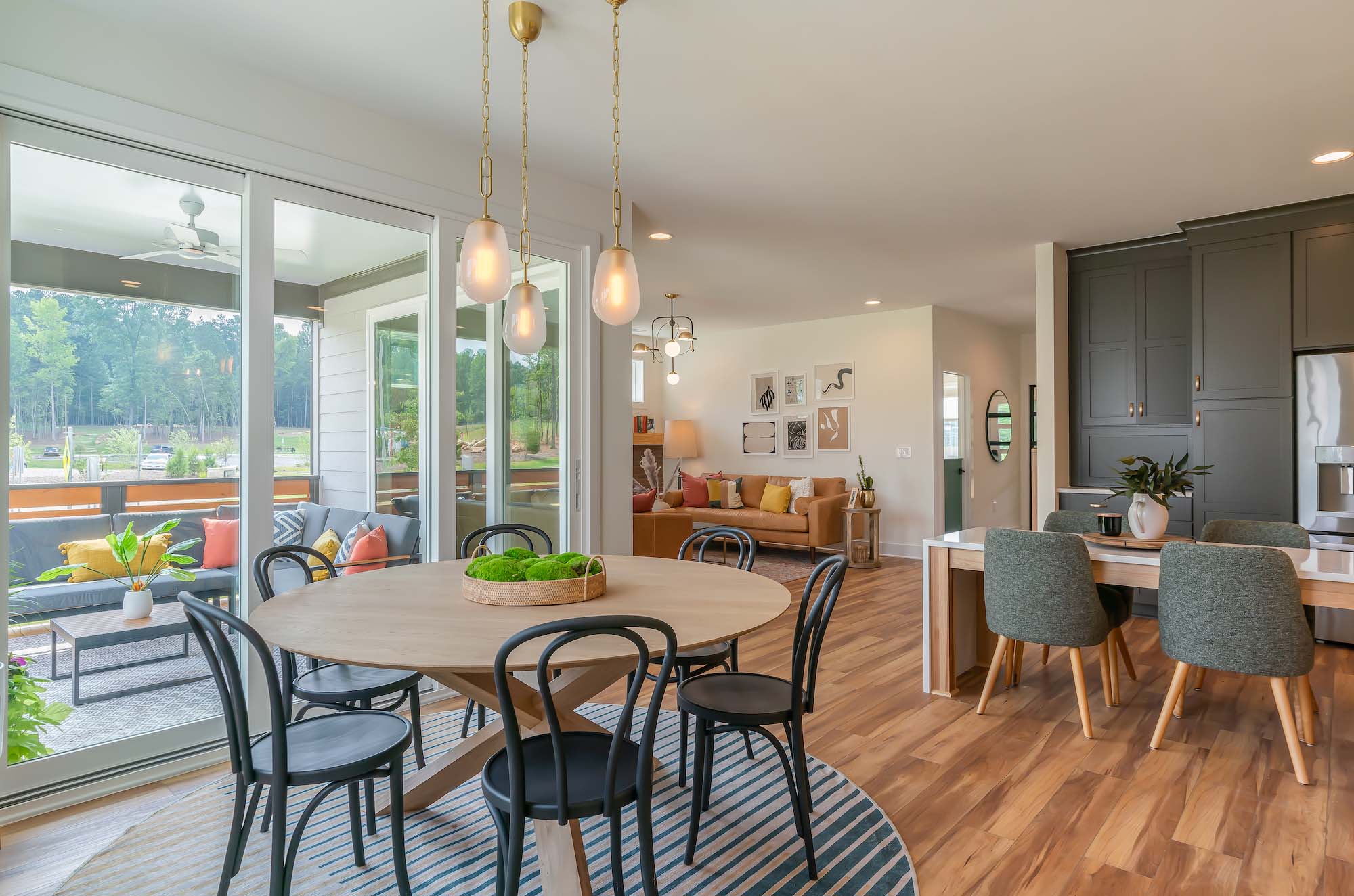
The way that we did that was that we paid a lot of attention to the entrances and the exits of the home and how you could entertain safely and how the home kind of transforms from a closed-in space to a wide open space, and how that was achievable within a certain square foot parameter. We don’t want this thing to be a Frankenstein, [an] unlimited square foot home. It’s a 2,600 square foot home, and so how many different ways can we reflect what the consumer wants through thoughtful design?
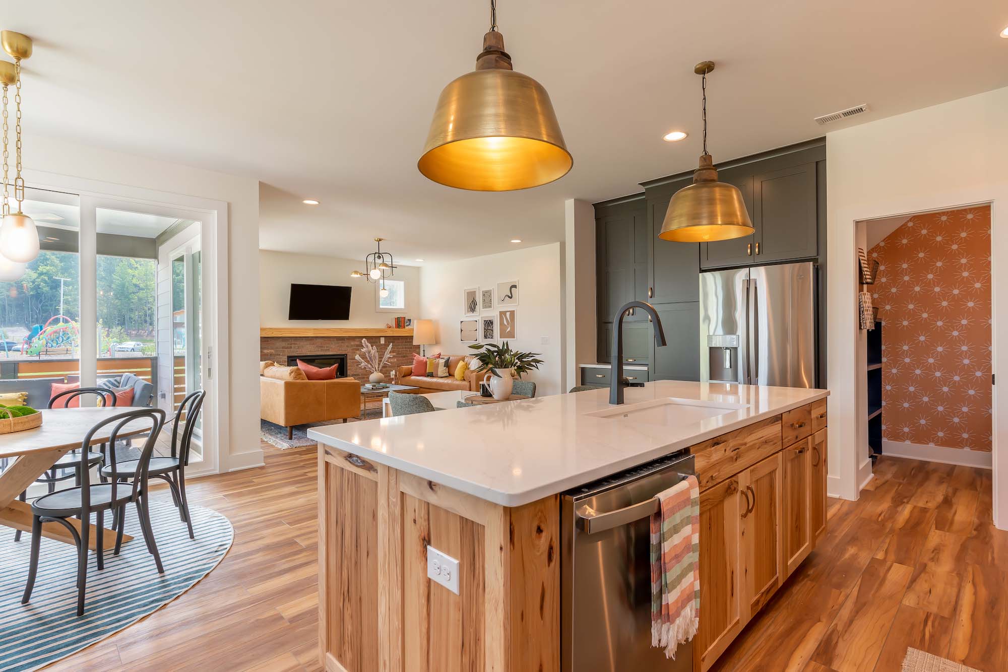
I think it forced a level of creativity amongst all of us to start thinking about homes differently. Builders can be quite prescriptive in the use of space, and I think what we wanted to do with this project was really empower the consumer and the homeowner to tell us how they want the space, and how they need the space, to perform for life from home.
How did you take this research and use it to create and design a home based on the study findings?
We did three design charrettes virtually to just talk about the study results. We all had to get oriented to the study, so architects, builders, consumer experience specialists and then the study founders, and we all had to review the study findings and then hold each other accountable to what that would mean for design, and kind of set our boundaries for how this home should look and feel.
We’re not building this home on an island — we’re building the home inside a master-planned community in Pittsboro, North Carolina called Chatham Park, which is a one-of-a-kind community in this area. It will be the largest of its kind [at] 20,000 units in a relatively small town. You’re building a town really within a town, and this is the centre of innovation, so how are we going to reflect that in our process?
For our design stretch, we met every Tuesday for three hours on Zoom. Initially we did table stakes, sort of “How do we want this home to look? What are the parameters for square footage, and price range and features? Because it can’t be a Frankenstein home of just parts that we want to do or have to extend from the outside to the inside to all the way through.”
We used Pinterest boards to facilitate a virtual design charette where we just pinned ideas that we thought reflected the data. We had these public Pinterest boards amongst the group and everybody pinned to the boards and then we voted a primitive sort of red [or] green. Room by room, a red dot meant that you didn’t like it and a green dot meant that you did, and ultimately, as the builder, I think we had a little bit more influence on “That’s feasible and that’s not. That’s in the price range and that’s not.”
And so, collectively, we came up with all of the images that we loved and the parameters that we were going to hold each other to and then the architects drew the floorplans for us, add then we all weighed in on how we wanted that floorplan to evolve.
You mentioned designing the home in a way that is not just adding more and more space onto the footprint, like a Frankenstein house. Can you elaborate on that idea a bit?
For me, that means that I’m trying to imagine how families use space. I’m trying to imagine all [of] the different family combinations first, and how the space will serve or not, that family combination. How will the space adjust to people with or without kids? How will the space adjust if you had a multi-generational family inside the home?
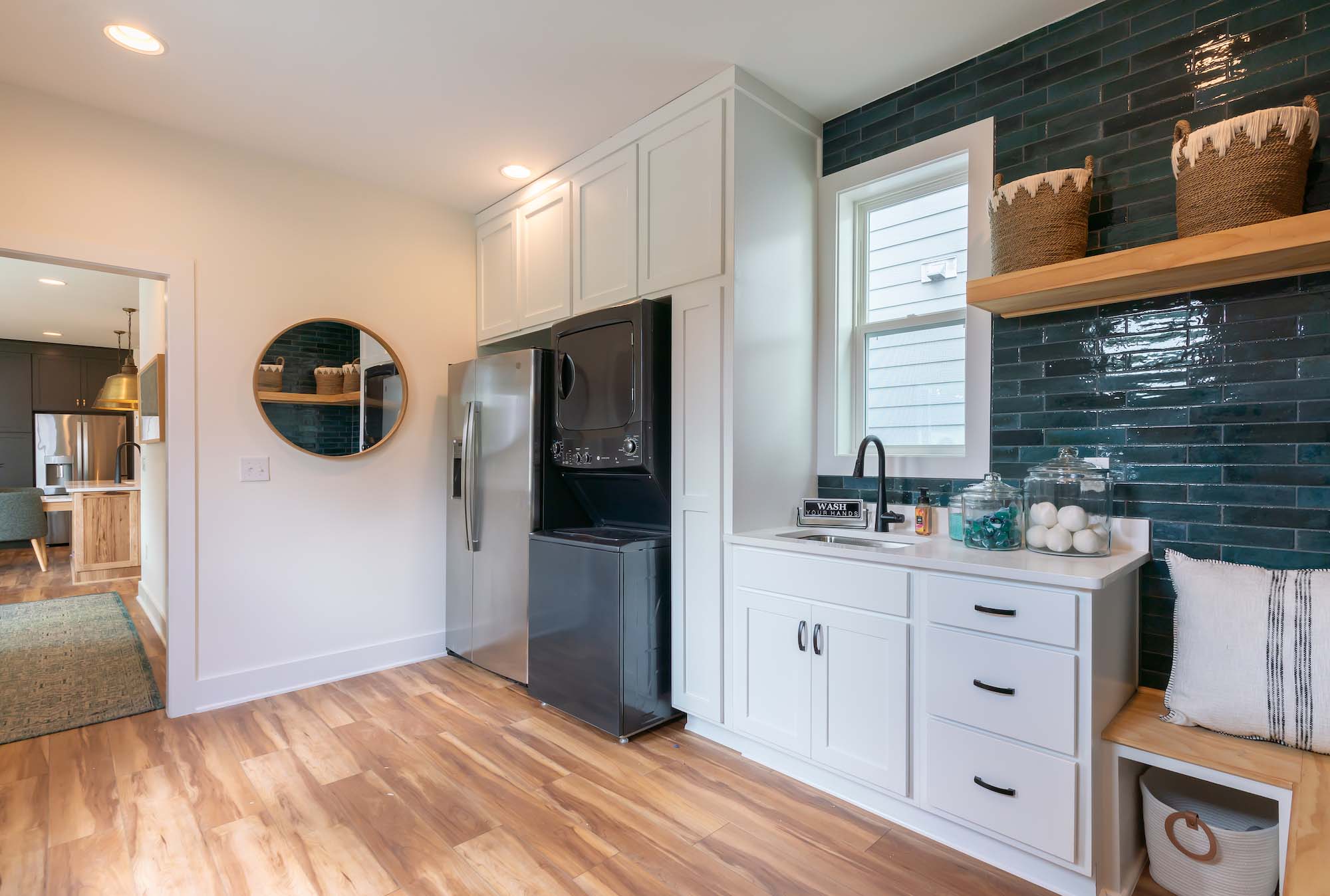
That space right before you go to your garage, needs to reflect what you need, where you need it. For us now, it’s about handwashing, or snacks or water. Coming back into the home, [it’s] even more intense in terms of decontamination and how we can keep the germs from outside and things we bring inside, how do we keep them in a room where they can be processed, laundered or washed [and] not infecting the other person? Sort of controlling traffic flow of things and people from the outside to the inside of the home.
I’m always imagining how the space is performing for the people that we imagine will be using it. [When it comes to] intention-setting for us, there was a huge burden of caregiving during the pandemic, especially for parents trying to work from home and kids schooling from home. We were very intentional with the kitchen being fully-accessible by the children, even though we’re designing this for an older Millennial family with one elementary school [age] child and one pre-schooler. And the reason we do that, [is because] we drill down to bat level [effectiveness] so we don’t lose the idea and try to create this home for everyone. Because if we boil it down to accents and really try to reflect this exact family, there are throughlines that other family formations will see in there.
For the kitchen, in [regards to] the caregiving of the home, we put open shelving on the island and located all of the children’s plates, and cups and their forks and their knives and even some of their art supplies [there] so that kids can be more independent in terms of getting themselves a snack or returning their plates to the dishwasher and locating that within easy proximity. [We built] a table into the island so that there could be a surface that could not be destroyed by art projects or food or whatever.
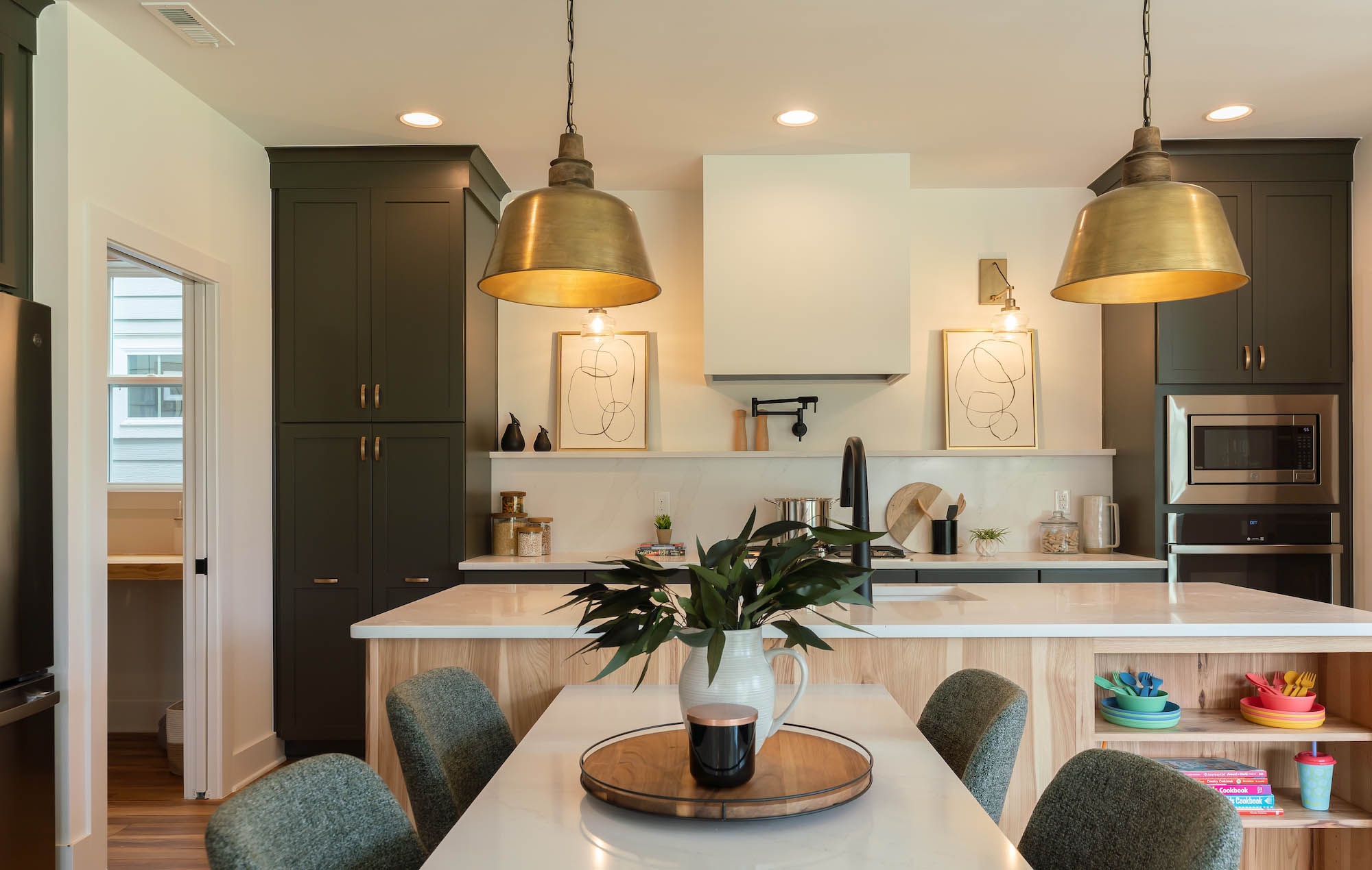
Imagining someone working from home and kids taking a bit more active [role] of their own caregiving. The pantry cabinets pull out and have drawers and sliding shelving that’s at their height so that every person is empowered to use the kitchen well, so not one person is involved in it. And touchless faucets make that fun for kids. The burden of handwashing is real, so how can we entice kids to want to do it more? [That’s] one way of sort of helping everyone out by making it a little bit easier.
Based on the research and personal experiences of spending more time at home during the pandemic, what were the biggest changes in the home that the Concept Home reflects?
Having two working spaces from home, two office spaces that aren’t part of another room, that aren’t part of a bedroom. For us, that meant finding a space for opportunity for smaller rooms that could accommodate big privacy.
So there’s a room under the stairs called a Zoom Room and it has a counter-height work surface so you can stand and give a presentation in there. It has bookshelves in the back that have an interesting background. It has a window with natural light so you have great lighting, and it’s proximate to the school which is the other space that we located on the first floor.
We did a dutch door on that space to sort of queque children this sense of arrival at school, knowing that when they were at school, to set the stage for the purpose of that room, and then closing it at the end of the day and arriving back at home as a child and being at home, just like parents who used to put our work away at the end of the day, and kids do as well. They need that sense of release. When they were at home during the pandemic, it got really blurry between “Am I at work? Am I at home? What am I doing?” and kids got really overwhelmed, so I think that whole school room is really innovative.
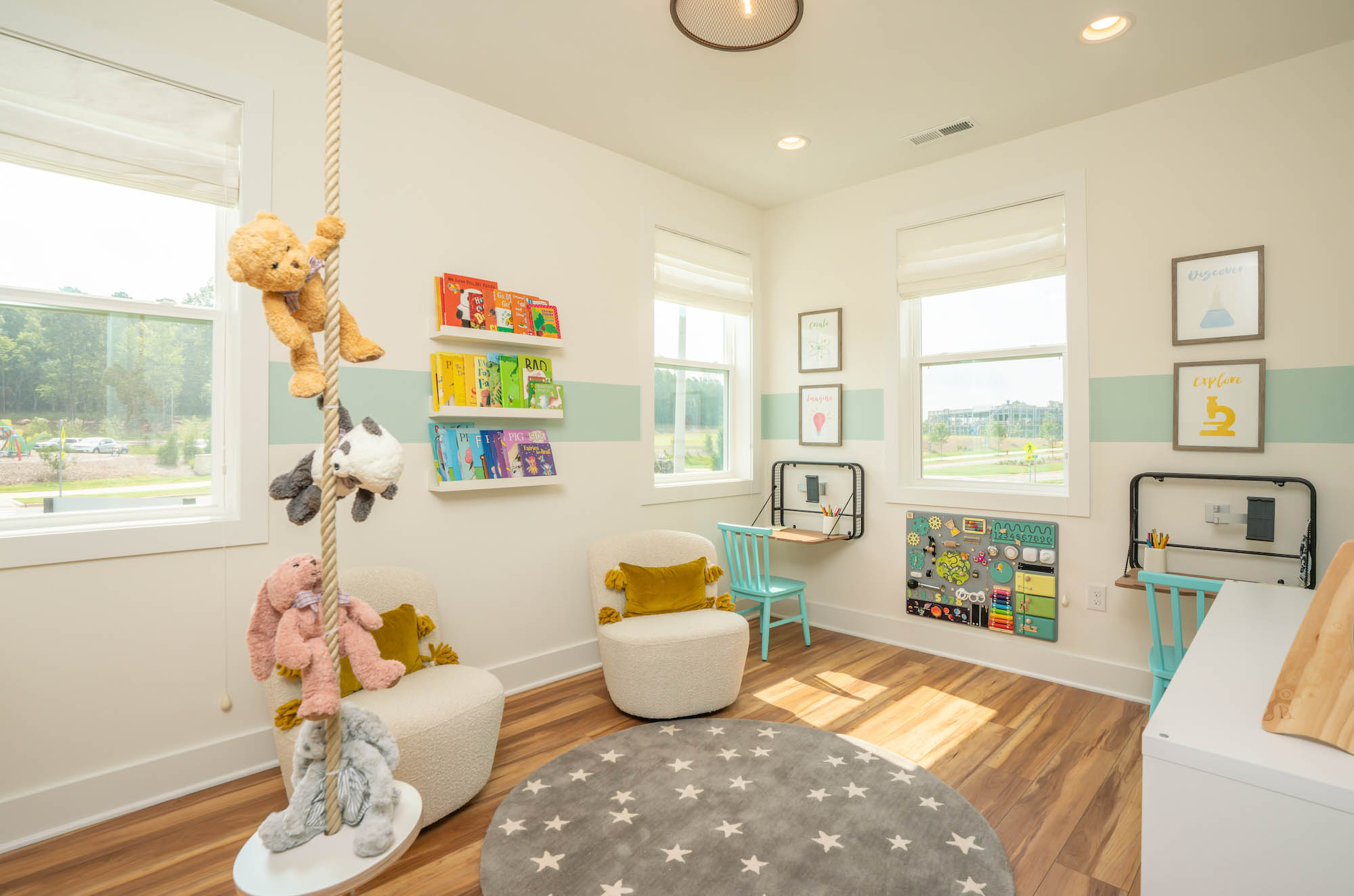
The other space that we really spent a lot of time on was the family bathroom, the concept of a larger family bathroom and a smaller primary bath. And the reason we did that was because a lot of times secondary bathrooms are soaked up by a get-into-a-bath or a bette bath and the problem with those spaces is that they are big enough for children who are old enough to be independant and take care of themselves, but there are a ton of doors. There’s a lot of doors in those spaces, and it can be hard to manage.
So if you have younger children who need caregiving at the end of the day [with] bathing and help brushing their teeth and getting them ready for bed and that whole night time ritual, that whole nighttime ritual is a nightmare in a space that doesn’t have enough square footage to accommodate the kids and the caregiver. So we allocated a lot more square footage to this idea of a hallway-access family bath that has a full shower and a full tub.
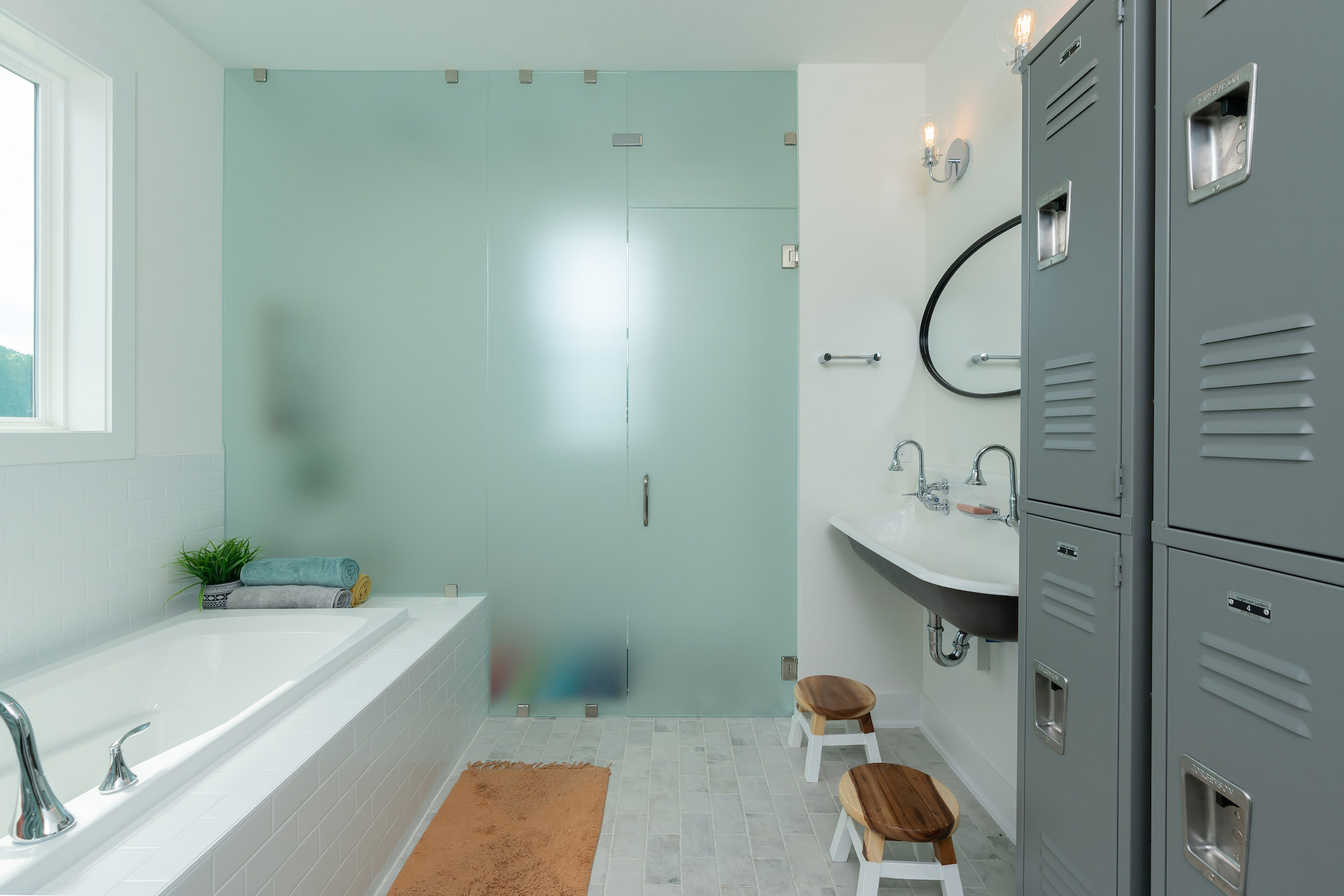
Because what ends up happening is instead of it being too small to properly care for your kids, they end up in your bathroom which is larger, in your bathtub, and then when you need a moment of self care after they’re in bed, you go to your bathtub and it’s full of toys. And that is just not a great feeling, and we wanted to make this space enticing to the kids to use, and also allow us to help us reserve the primary bath for the primary occupants and not have to share that necessarily with the kids. It’s a beautiful bathroom. It has a glass wall, and it also grows with the kids. It has a full-sized shower with a bench and tub and this huge picture window in it. It’s a really interesting and different space.
What has the response been like about the Concept Home from the industry and home buyers? What will you do next?
We continue to research, we want to attempt to continue to research. We have these decals in the garage that we invite people to respond to the areas they like the most, something we may have missed, an idea that they wish we would have explored. [There is] a summary of the data and how we used the spaces to reflect that data, so sort of directing people towards “This is what the data said that this is how we responded to it,” and sort of giving people an opportunity to check us and participate and continue the conversation about how people use space.
I think what we’re going to do next, and I know we’ve already done this, is try to go through a much more robust process of designing spaces, and thinking about family formations and how we reflect space, and also soliciting more direct consumer feedback when we are designing collections and including some of the consumers in that process on voting on different arrangements of space, different options in those spaces. I know we’ve already done that in some of our price ranges.
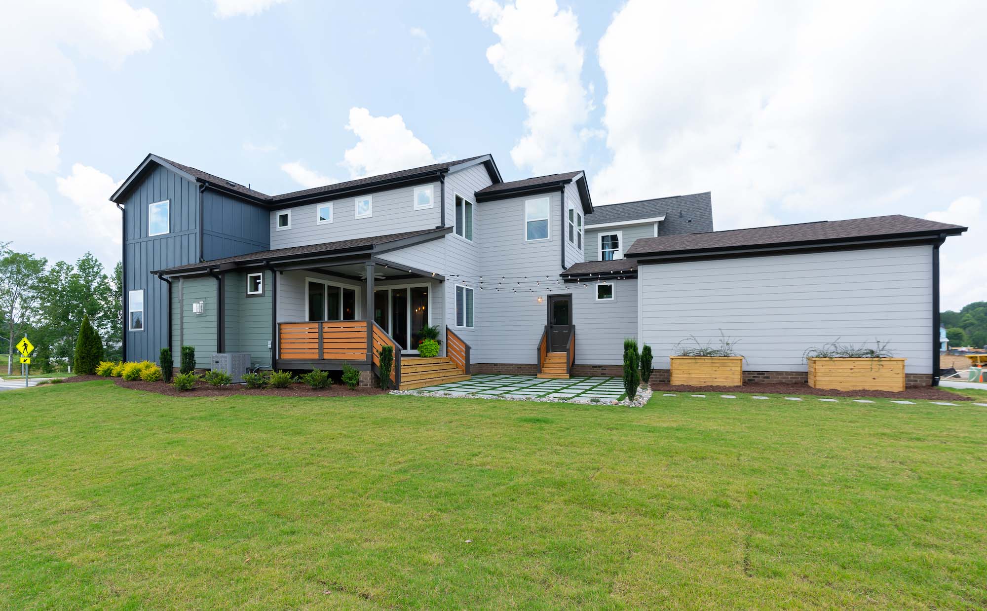
I think what we’ll do next though is I’d love to see someone else build a Concept Home based on the feedback that is a smaller home with smaller square footage, a cottage home, because I think these concepts can be reflected in every price range. What I’d really like to do is spend my time finding a builder who’d love to take this on and build in a different part of the country and reflect it in a different price range. I think that will be our new creative exercise, and there will be a lot of puzzles to solve in that.
How do you think the Concept Home will influence new construction homes in North America, post-pandemic?
I hope it tells people that the bar has been raised for homes and for designing spaces and floorplans and we need to meet the buyer or the consumer where they are, and really start with what their life looks like and how we want our spaces to feel and how we want our spaces to make the buyer feel.
I want them to feel empowered. I want them to feel comforted and safe and courageous and able to live their life that they dreamt about. I can’t do that by designing homes in a bubble without collaborating and asking people about what their life is like behind closed doors. I think sometimes we run the risk of designing homes that feel like fairytale spaces maybe, that may think [that] everyone lives these perfect lives, [and instead] embracing the difficulties and the burdens people that face and wanting to make sure our spaces reach them in their darkest moments and their best moments.
I hope this home inspires builders to embrace design from adversity, from a time when life has been difficult for people, and helping them stay connected to the people they love but also stay safe at the same time. I don’t think that we’re going back to life as normal. I think that there is a new normal, and I like being more intentional and thoughtful about how we can invite people into the practice of collaboration to effect homebuilding.












 Maziar Moini, Broker of Record - Home Leader Realty Inc.
300 Richmond St. W., #300, Toronto, ON M5V-1X2

